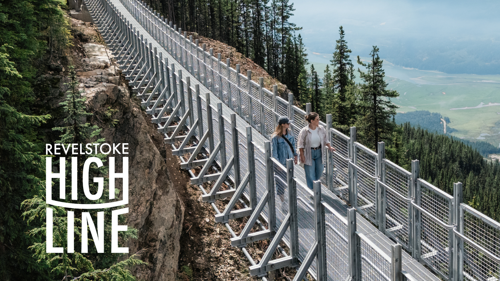
Revelstoke Highline
Logo & Branding Design
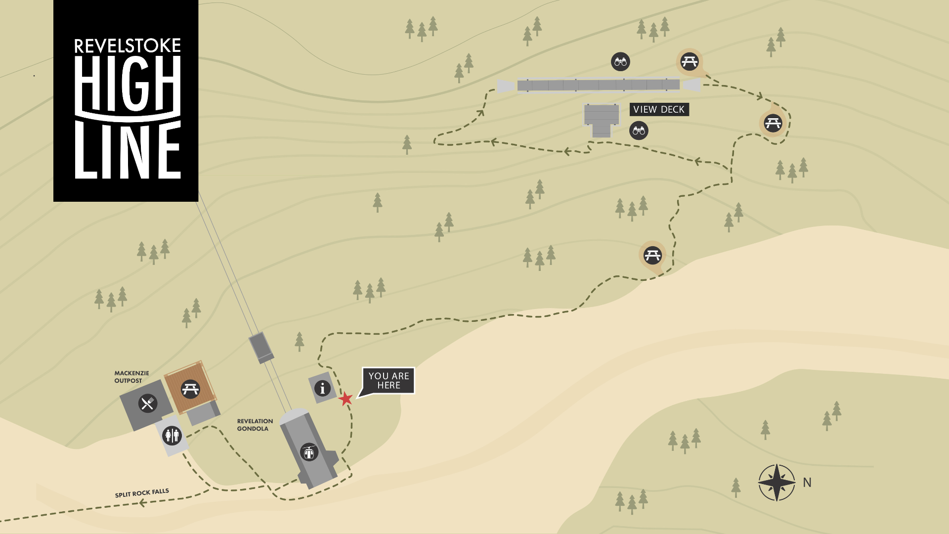
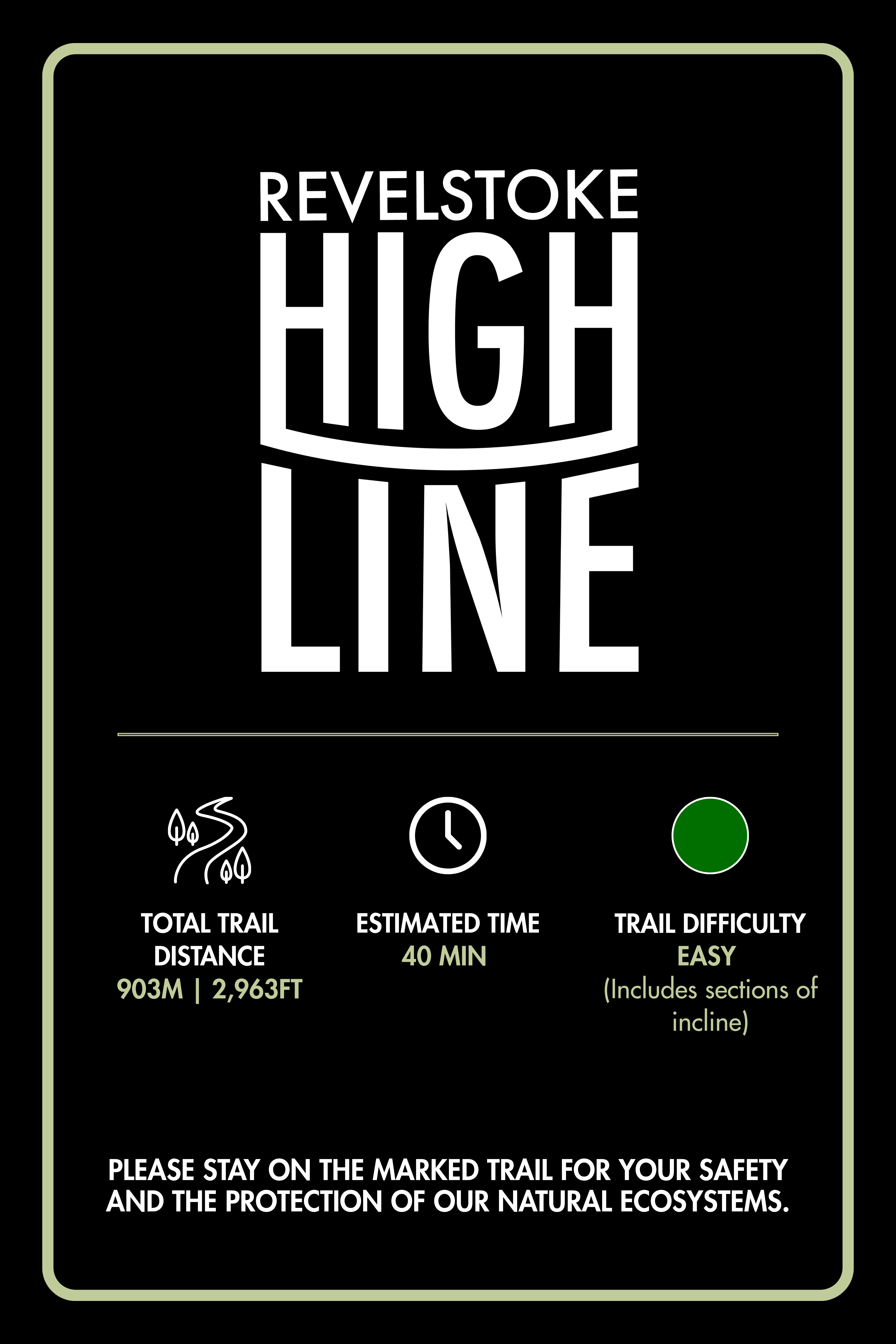
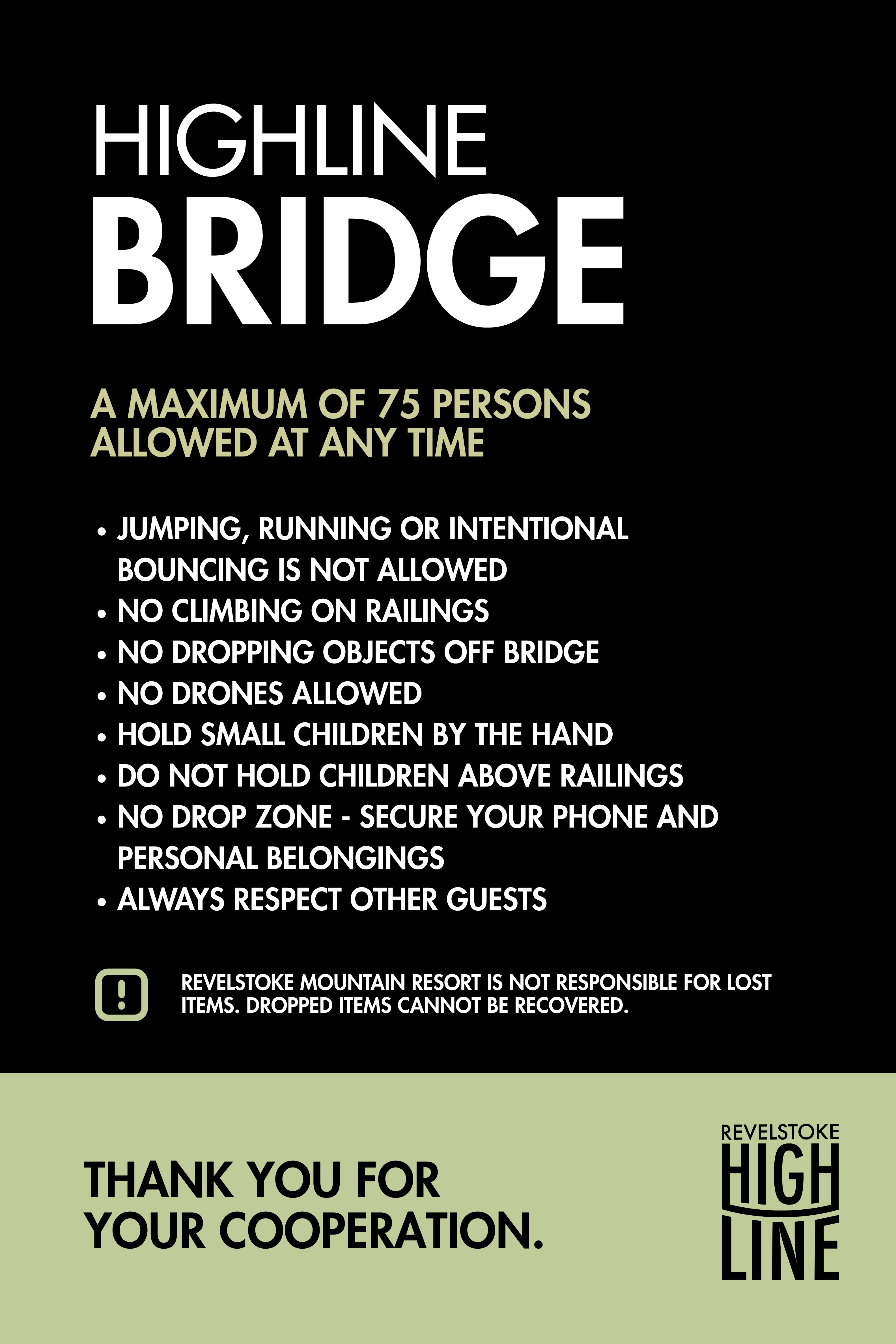
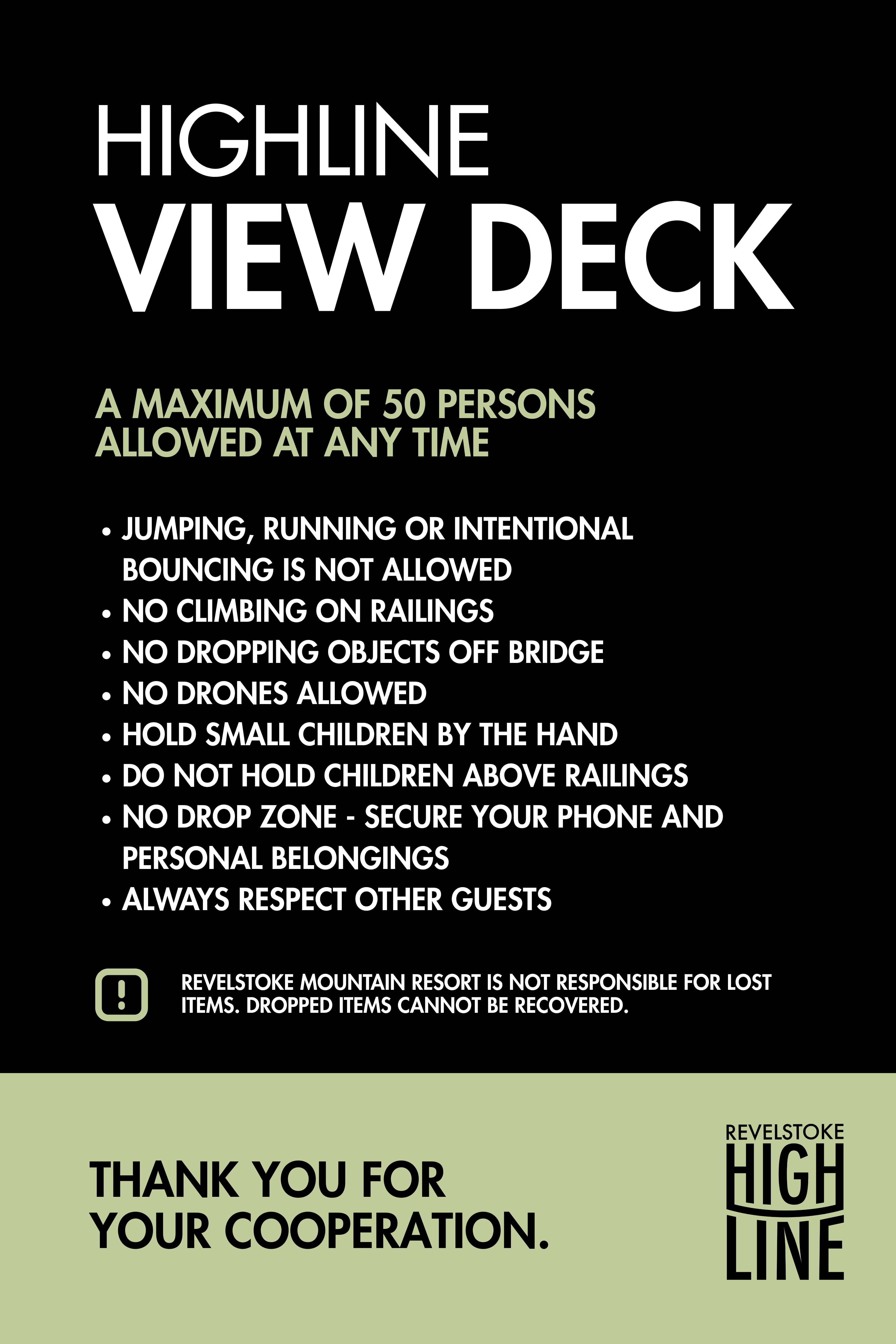
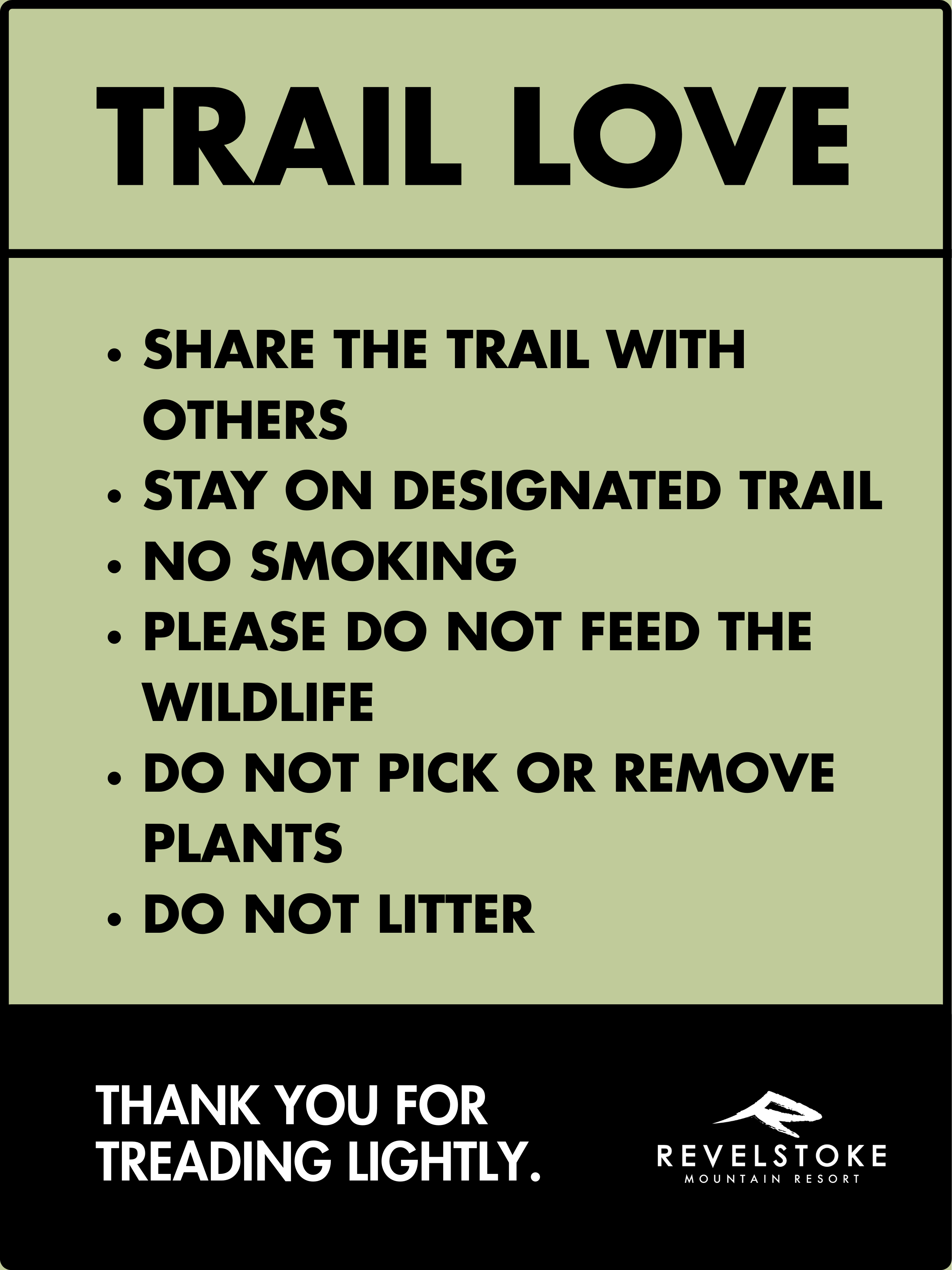
Signage & Map Design
THE CHALLENGE:
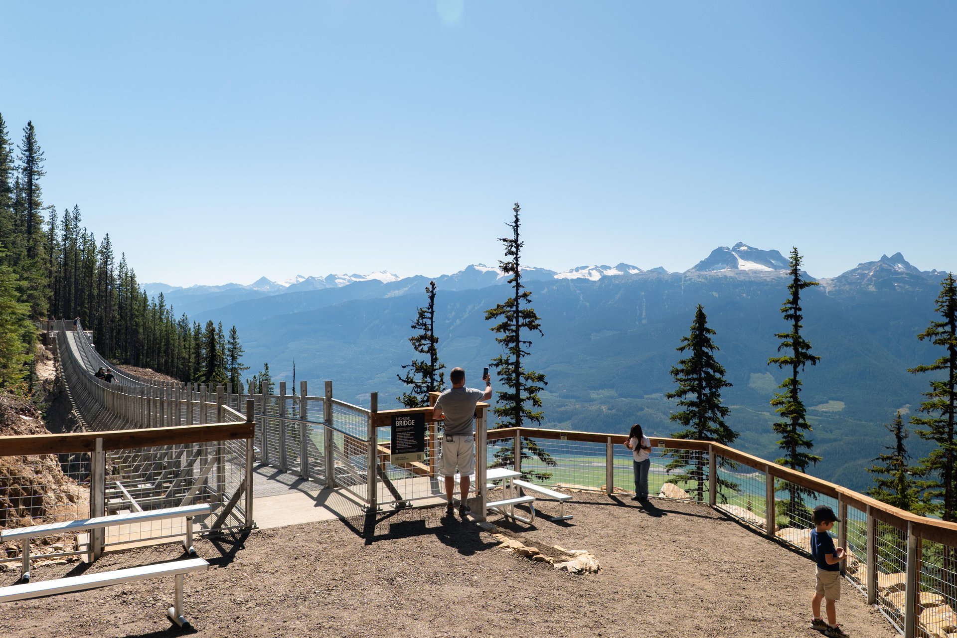
Develop an identity and signage system for BC’s newest suspension bridge.
THE IDEA:
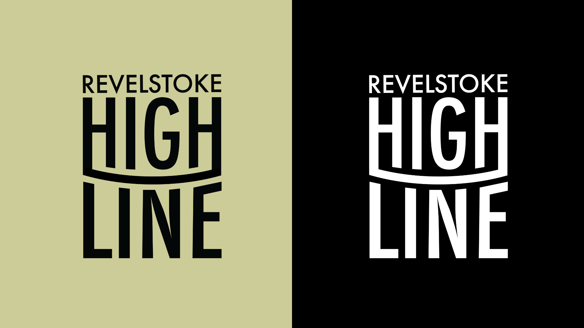
The idea centered on drawing cues from Revelstoke’s core brand language: bold typography with character, and a colour palette distilled from nature, and extending it to a summer-specific experience. The palette of deep forest green, true black, and contrasting neutrals echoes the forests, mountains, and landscape of the region. By rooting Highline’s visual identity in these established colours and typographic rhythms, the design stands as both a natural extension of Revelstoke’s world-class outdoor narrative and a unique expression of this elevated adventure destination. Creating a distinct graphic word mark, allowed the design to communicate the product, without feeling to busy.
Develop an identity and signage system for BC’s newest suspension bridge.
THE IDEA:
The idea centered on drawing cues from Revelstoke’s core brand language: bold typography with character, and a colour palette distilled from nature, and extending it to a summer-specific experience. The palette of deep forest green, true black, and contrasting neutrals echoes the forests, mountains, and landscape of the region. By rooting Highline’s visual identity in these established colours and typographic rhythms, the design stands as both a natural extension of Revelstoke’s world-class outdoor narrative and a unique expression of this elevated adventure destination. Creating a distinct graphic word mark, allowed the design to communicate the product, without feeling to busy.