Revelstoke Mountain Resort
Revised Brand Guidelines & Creative
THE CHALLENGE
Revelstoke Mountain Resort is an iconic destination for legendary powder, big mountain terrain and small town charm.
Revelstoke Mountain Resort is an iconic destination for legendary powder, big mountain terrain and small town charm.
As the resort expands beyond a world-class ski destination into a growing, year-round mountain community, the need for a more refined and consistent visual identity emerged.
The challenge was to bring clarity and cohesion to an increasingly complex ecosystem, while preserving the authenticity and rugged appeal that defines Revelstoke.


THE IDEA AND PROCESS
With iconic landscapes and expansive alpine views, the brand didn’t need to add more, it needed to do less. The goal was to remove visual noise and allow Revelstoke’s most powerful asset to lead: its photography. By simplifying the system, the mountain could speak for itself.
With iconic landscapes and expansive alpine views, the brand didn’t need to add more, it needed to do less. The goal was to remove visual noise and allow Revelstoke’s most powerful asset to lead: its photography. By simplifying the system, the mountain could speak for itself.
Over time, layers of growth had blurred brand systems and weakened consistency. The solution was to establish clear structures and disciplined guidelines that could scale across a layered business while restoring confidence and clarity. A cleaner, more restrained visual language ensured the brand’s presence felt as assured as the skiing itself.
The palette was refined to reflect that confidence, evolving the core navy into a timeless black while retaining Revelstoke’s distinctive teal. Clean, crisp, and considered, the system mirrors the clarity of mountain air and the precision of the terrain it represents.
Brand Guidelines Sample


Digital Ad Template

Trail Map Redesign


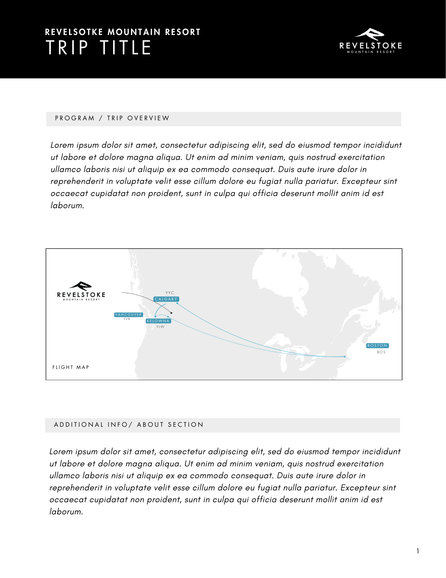
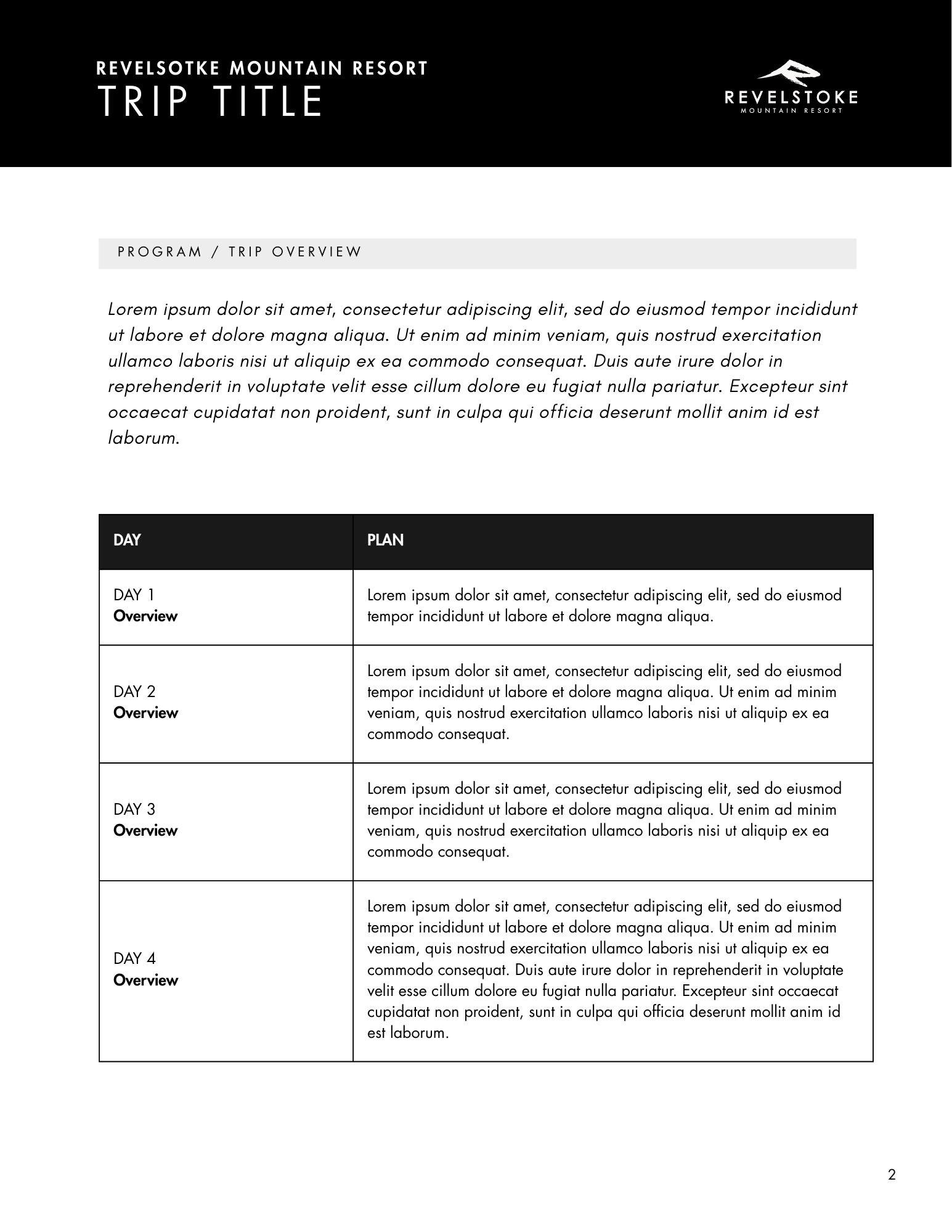
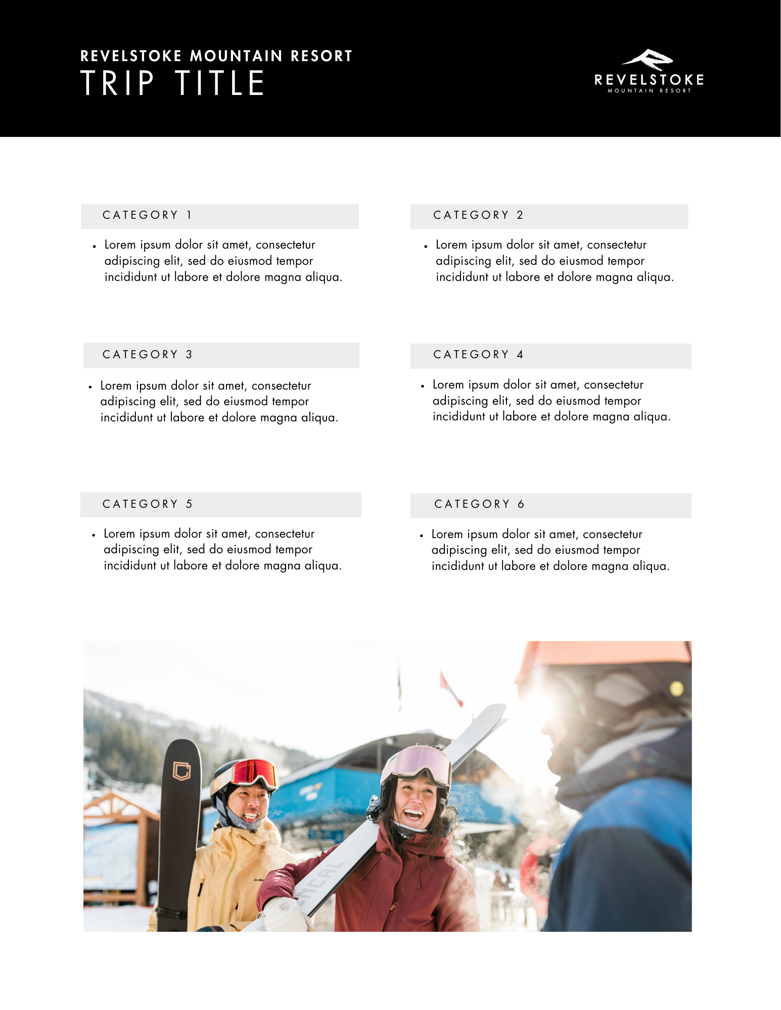
Document Package Template Example
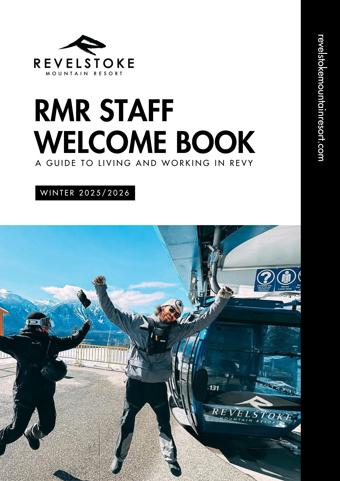
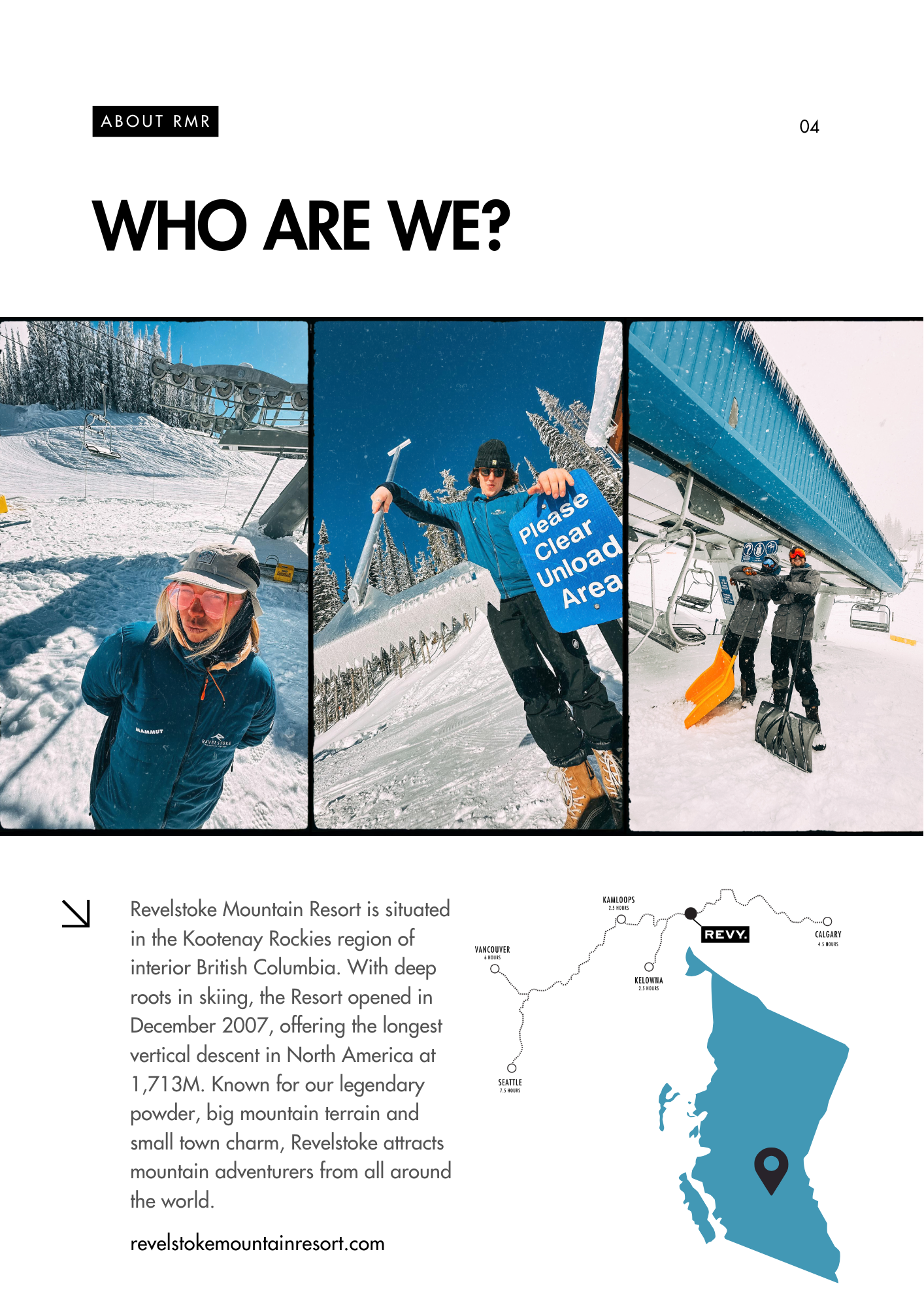
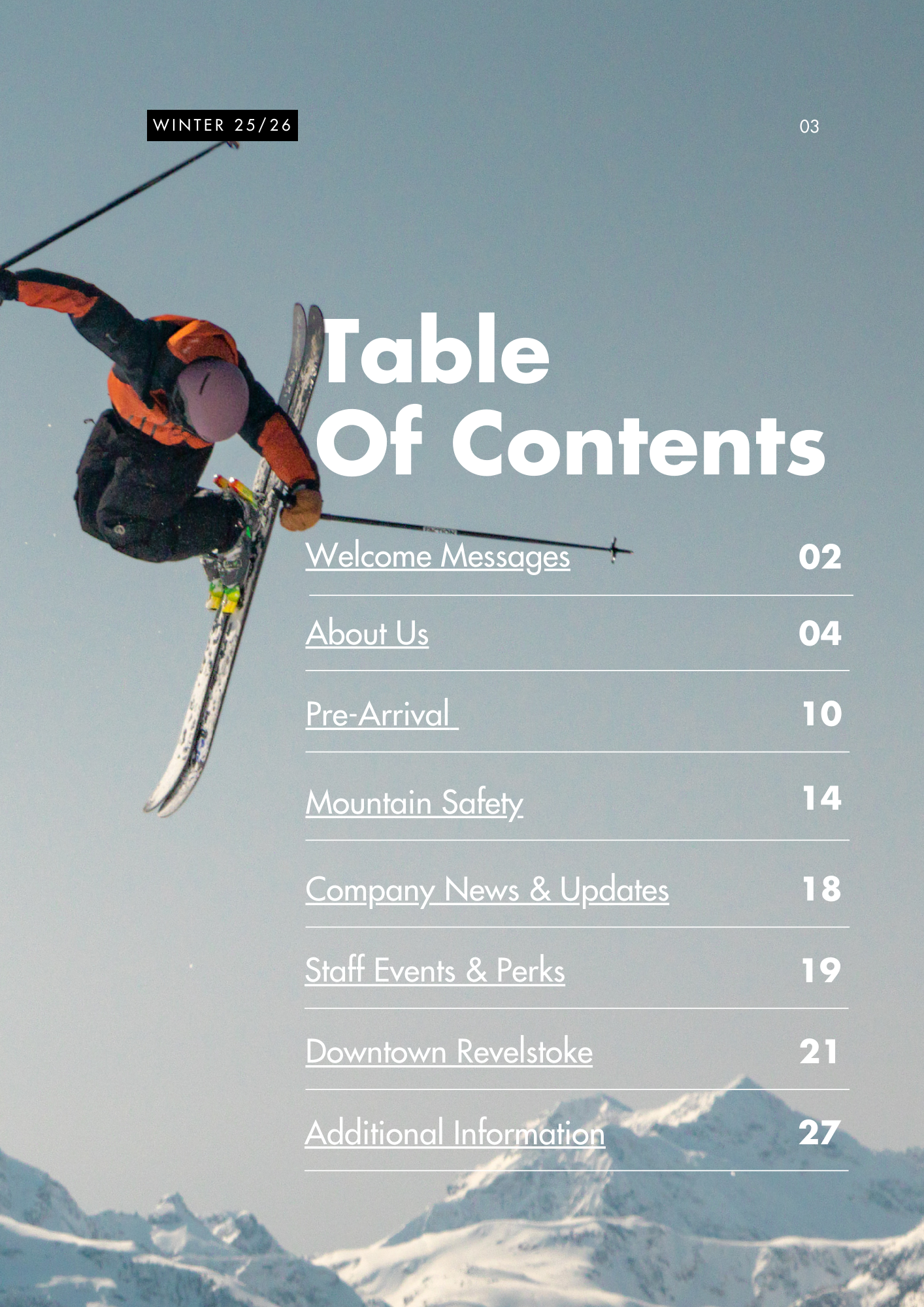
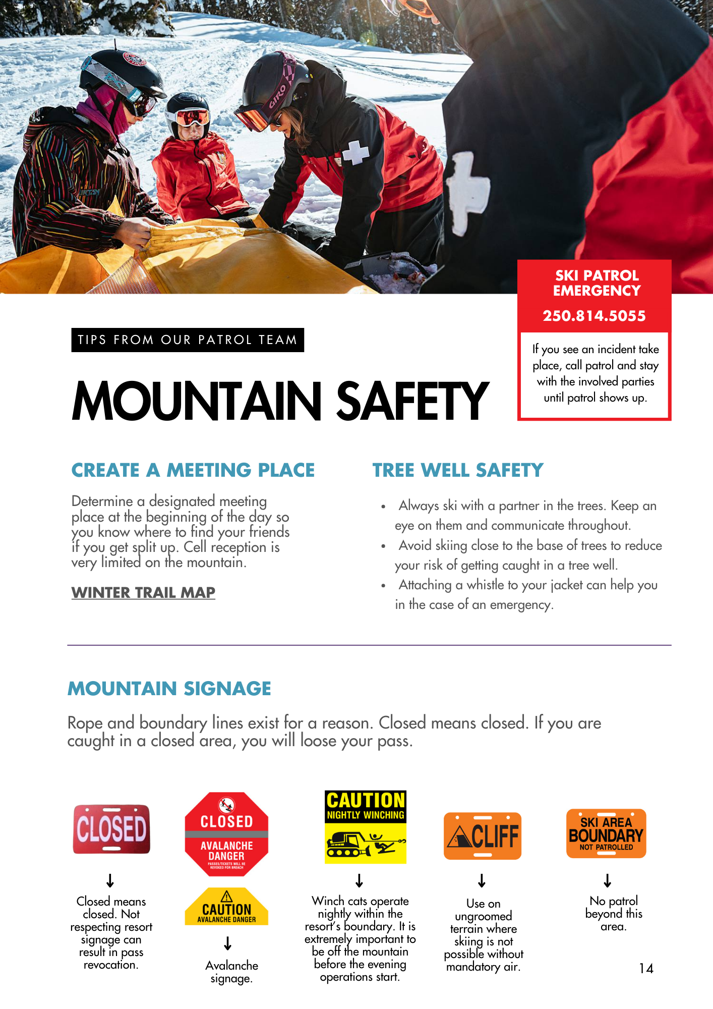
Staff Handbook
Allowing the brand elements to flex in tone was a key consideration. While external sales and marketing materials require a more polished, aspirational expression of the brand, internal communications serve a different purpose. For staff-facing documents, approachability and clarity matter just as much as consistency.
The staff handbook became an opportunity to apply the brand system in a more playful, human way, using energy, warmth, and visual lightness to engage employees and make traditionally “boring” onboarding information feel accessible and easy to absorb.