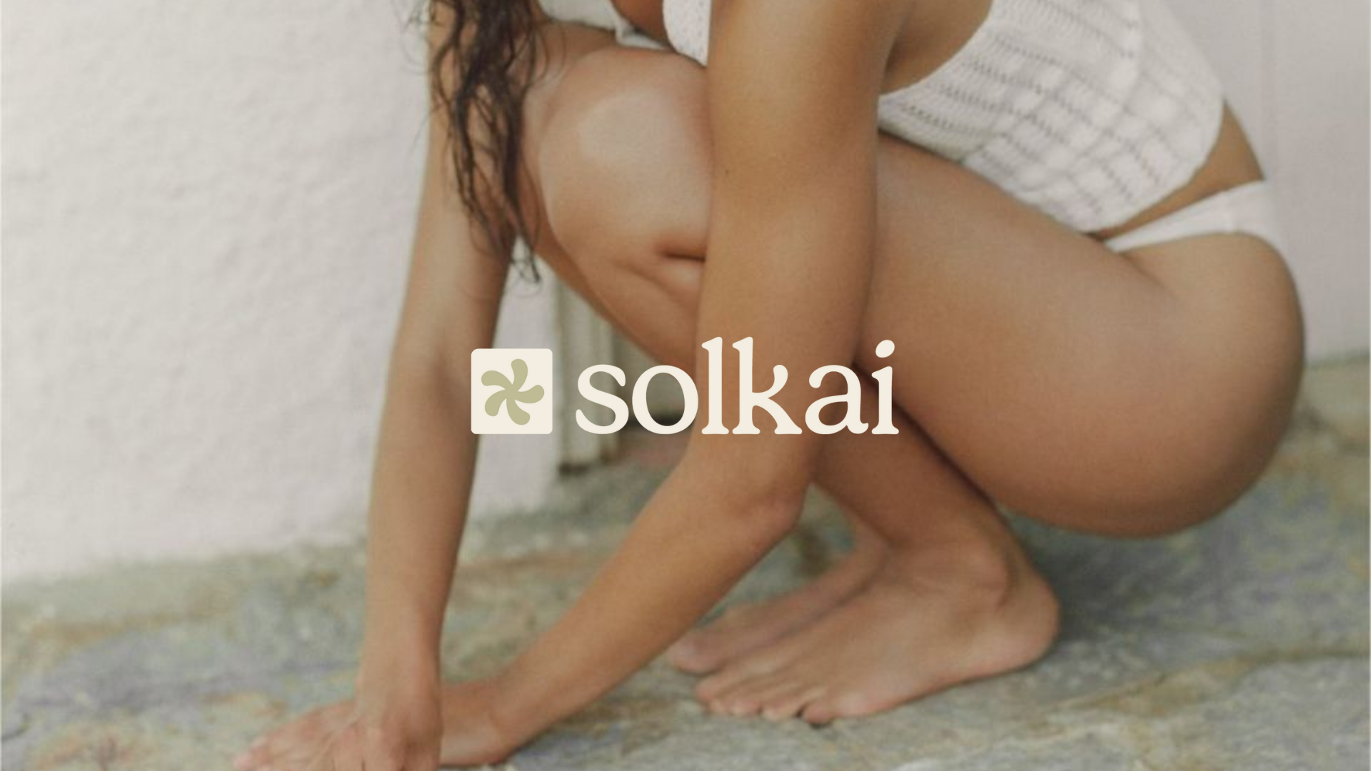
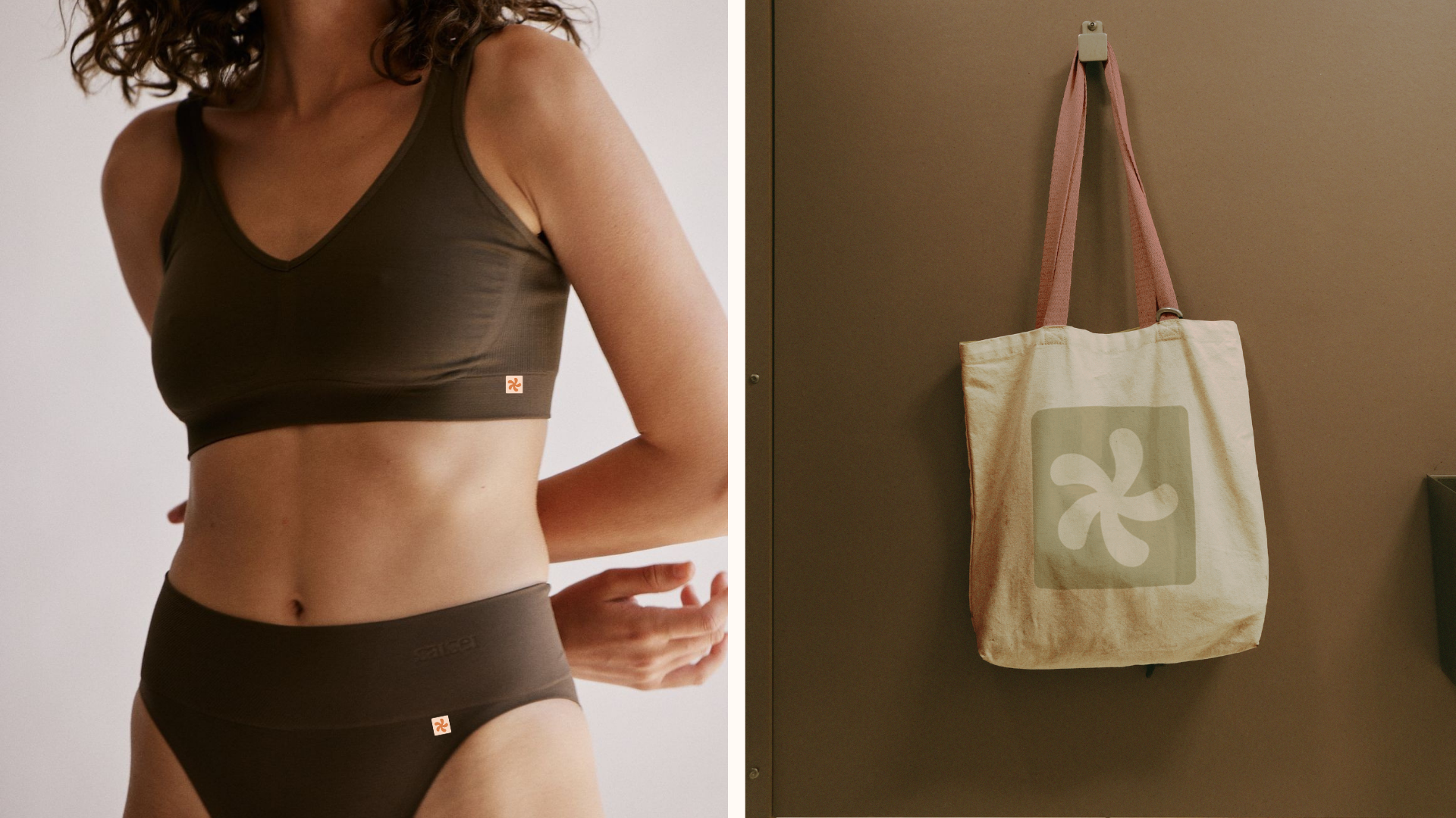
Solkai
Full Brand Design
Logo Design
Brand Strategy
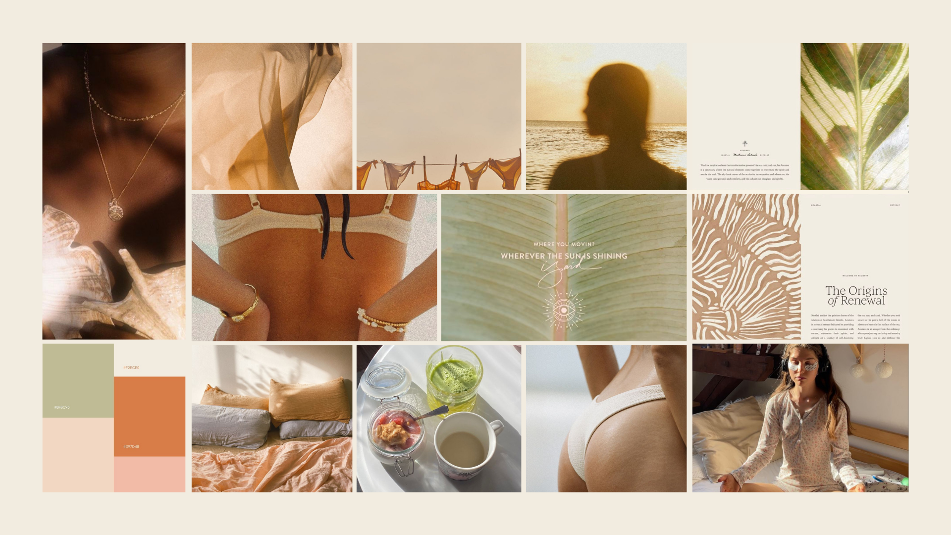
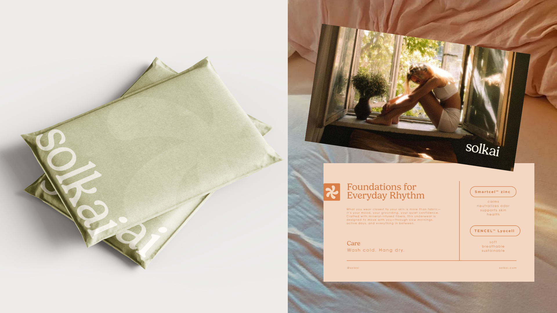
Born on the Australian coast, Solkai creates mineral-infused underwear designed to move with you. Crafted from smartcel™ zinc and ultra-soft TENCEL™, each piece offers softness, breathability, and ease. No wellness fluff, just quiet care, natural materials, and base layers that feels like a ritual for body, breath, and soul.
* Launching 2026
* Launching 2026